Front cover- On my front cover I have changed one of my side stories to "7 tips to becoming a DJ" so it gives the reader something to do and they can learn something from reading that article. I have also changed the image for my poster in the top right hand corner so it looks more like a poster image. I have also added a silhouette to the article about the DJ who has hit back against rumors, this adds an element of mystery to the magazine. I have also added that John Lloyd is an international DJ. This will let the reader know what he is as soon as they look at the front cover.
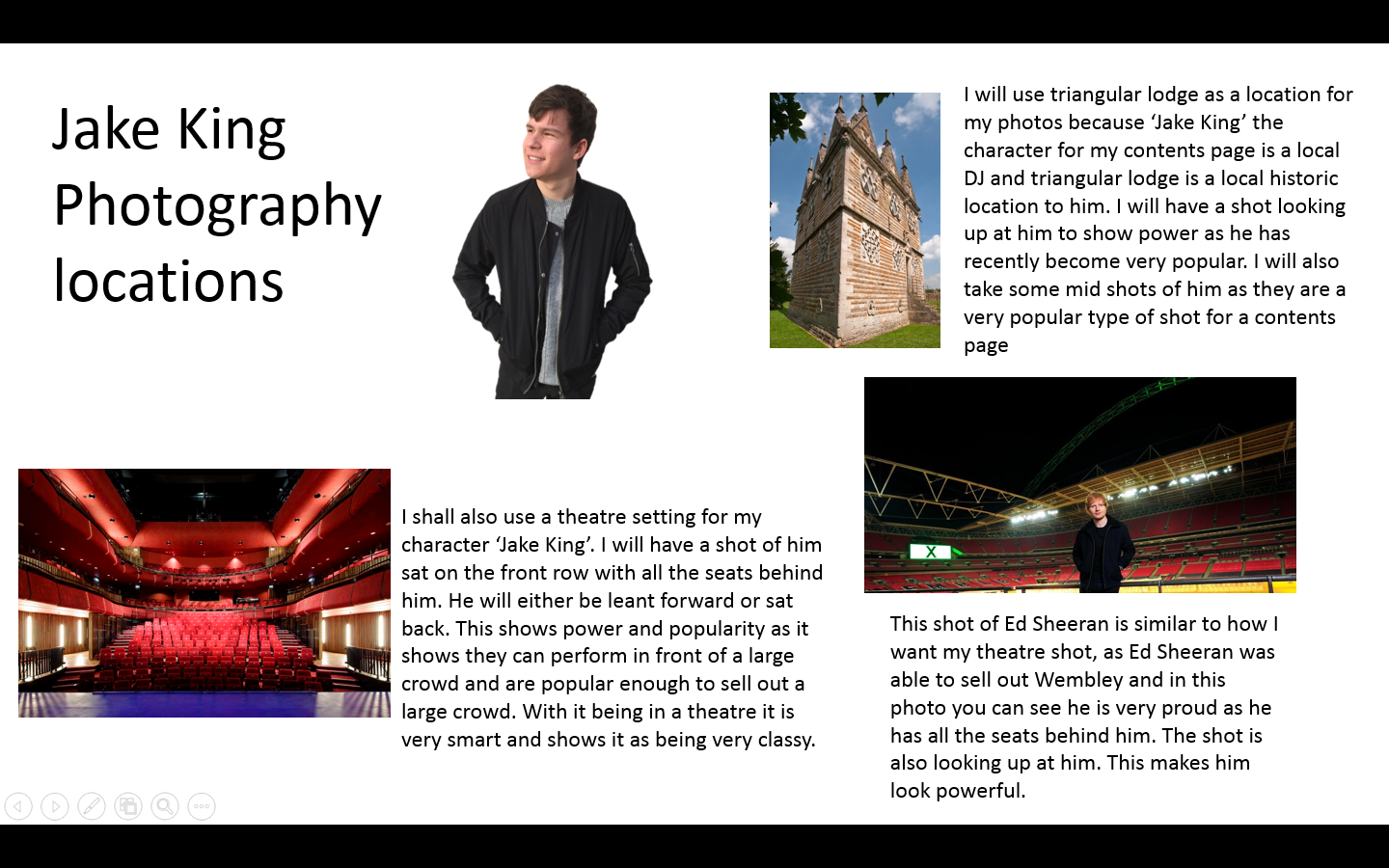
Contents page- On my contents page I have added a website so readers of the magazine can subscribe to the magazine. This adds the element of social media and internet to my magazine which fits my target audience as they are teenagers and teenagers tend to use a lot of social media and internet. I have also changed what Jake King is saying by adding the word DJ. This is so readers know what genre of music he performs and creates.
Double page spread- On my double page spread I have changed what John Lloyd is saying to 'I'm getting famous so quickly'. This shows he is a rising star and many readers and fans of music are very interested in new music stars. I have also added who the magazine are interviewing the following week, this is so the readers can determine if they're going to buy the magazine to read the article. I have also made the Intro to the text stand out. This is to let the audience know where the text starts.
Tuesday 26 April 2016

Monday 25 April 2016

Sunday 24 April 2016


Friday 22 April 2016
Thursday 21 April 2016
Changes I made to get my final pieces
Front cover- To Improve my front cover I have made the image brighter, added many more cover lines and used various colours and fonts. I have also added an article about a poster in the top right hand corner which I added another one of my images.
Contents page- I gave my contents page a whole new look by adding new images, new colours fonts and layout. To get this final contents page I looked at many examples to help me create this final one which i believe is a much bigger improvement.
Double page spread- For my double page spread I have made the image brighter and have evenly spaced out my columns and added a small picture in-between the text as this is very common on double page spreads. I have also added the word "exclusive" at the top so the page has is specifically important.
Thursday 17 March 2016

Wednesday 16 March 2016
Evaluation of improved double page spread
In my improved double page spread I have made the heading smaller, I made the image sharper and I have put what is on the page at the top. After feedback people have said my double page spread looks clean, sharp and professional.

Evaluation of my improved contents page
In my new and improved contents page I have put a perimeter around the snapchat feature, I have enlarged 'contents'. I have also moved my date up towards the top left corner as it is where you would usually find the date and finally have slightly enlarged the image at the bottom to fill up the space more.

Sunday 13 March 2016
Evaluation of my most recent photoshoot
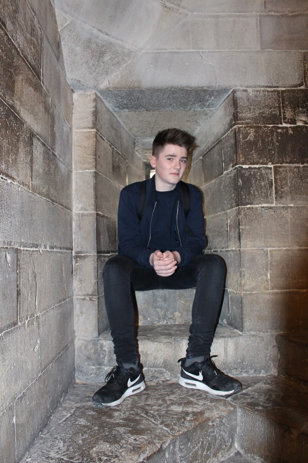
I took the photos for my most recent photoshoot in Florence in Italy. For this photoshoot i put my characters in costume and got them to pose in the positions i wanted. The final i mages are how i imagined them to look and i will use them on my double page spread and my contents page. Lots of colour is being used in the images so it can draw the audiences eye quickly.


Wednesday 9 March 2016

Monday 29 February 2016
Evaluation of my updated cover page.
For my new cover page I have used a software called Photoshop, using this technology has abled me to make my cover look clean and fresh. I have also added lighting effects to my images to give it a festival/nightclub look. I have also added more sub headings and enlarged and taken more images. This makes the cover page look much more filled so there is more for the audience to look at. the image of my character is also much more central and is looking forward. Almost like he is looking at the audience, this makes a connection between the magazine and audience. I have also enlarged my cover line as most cover lines on magazines take up 20% of the page. This version of my cover page is a very big improvement from my first attempt.
Friday 26 February 2016

Friday 5 February 2016

Friday 29 January 2016


Wednesday 27 January 2016

Sunday 24 January 2016
What I will do with the interview
I will now use this interview to help create my double page spread. I will use all my information i gathered from the interview to create a double page spread on my character. Many magazines do this so fans can get to know their favourite artists and begin to know them. My next stage is to start choosing and designing a layout for my cover page, contents page and double page spread.

Friday 22 January 2016
The interview


Subscribe to:
Posts (Atom)